

Illinois Unit Impact Reports
BRIEF
In my design role at the University of Illinois Urbana-Champaign (OVCIA) I created for both digital and print spaces, with a focus on web and user experience/interface design. This specific project focuses on updating the web design for our annual unit impact reports. Each year we review the previous year’s metrics, feedback, and design. We look at its strengths and weaknesses and see how we might improve. We also run our web designs through accessibility software and apply any new university branding guidelines to ensure our designs are inclusive, effective, and up to date.
(user experience design, use interface design, digital)
DELIVERABLES
Webpage designs, webpage templates, web components, prototypes.
Before

Process
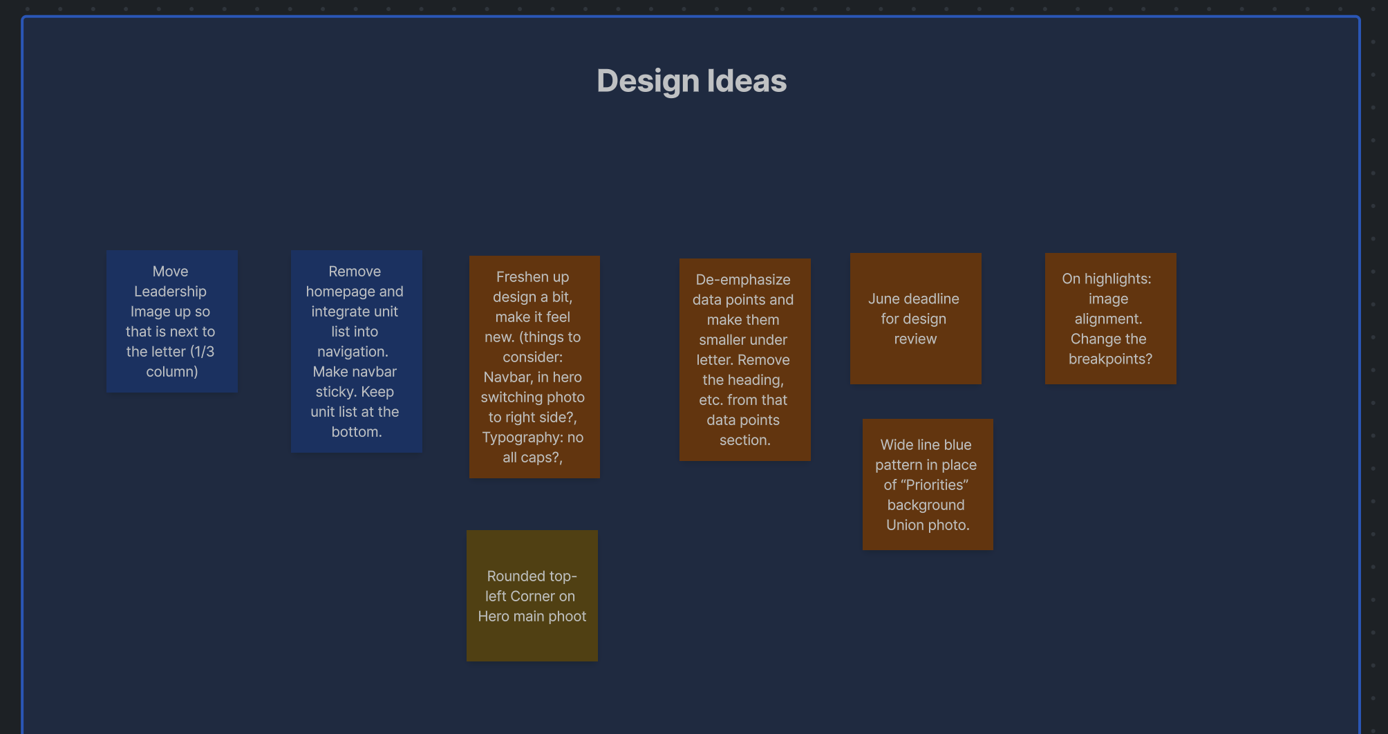
Brainstorming
Working with the art director and project team, we came up with different ideas we might consider implementing into this year’s design and laid them out on a confluence board for reference.
We decided to forgo a landing page that appeared before navigating to an impact report webpage. This was an efficient option because it allowed for less clicks and less design work. Instead, we would implement a sticky navigation that expanded and collapsed on each impact report webpage, giving the users the choice to navigate to another impact report while simultaneously viewing one.

Inspiration & Design

Prototyping & Final Design
After a basic static webpage design is approved, I begin my prototyping stage. In this stage, I will show my prototypes to our developer and walk through the user flow, components, and other details. From there, we decide what is possible and what we might tweak. Usually more (small) changes are made in order to ensure desktop and mobile designs translate smoothly to development.
One issue we noticed was the outline on the chips within the navigation were not heavy enough to be accessible. In order to make them accessible, we increased the stroke weight from 1px to 2px (implemented on live webpage, not prototype) After this change, our accessibility software came back approved!
Once all revisions are made, I touch base with development again or send a screen recording to communicate how new changes were implemented. After development finishes creating the webpage on the backend and everything is approved by the project team, the webpage goes live!
Desktop

Mobile

After

With all of the new goals for this year’s design in mind, I went ahead and started creating mockups on Figma. I knew we didn’t want to reinvent the wheel, as we were still planning to include the same kind of content. However I did apply some new subtle design elements to reflect updated university branding guidelines, such as the curved corner on photos, ascending line background graphics, etc.
I also created a new navigation bar that reappears at the end of the page (auto expanded). When I was contemplating how the navigation bar should look, I drew inspiration from the illinois.edu website where chips were used to tag and filter different colleges, schools, and institutes.

